SECURIAN FINANCIALRevamping a careers site experience to attract potential job applicants
ROLEUX Designer
TIME2022 Internship
INDUSTRYFinance
CLIENTSecurian Financial

Overview
Securian Financial, a life insurance company based in St. Paul, MN, aimed to attract and engage new talent to expand its diverse and skilled team. The Marketing team introduced the new slogan, "Be you, with us," to encourage individuals to bring their authentic selves to an innovative work environment. To support this initiative, Securian Financial sought to reimagine the digital careers experience on its website.
As the sole UX Intern, I worked alongside multiple stakeholders to redesign the careers website, conducting a heuristic evaluation, leading UX research initiatives, and designing the new experience.

Goals
1
To improve the existing information architecture and site experience, identifying heuristic flaws and needs for content updates.

2
To incorporate new messaging created by the HR & Marketing teams through a redesigned and more innovative user experience.

The Process — Discovery
Understand the Users
I conducted exploratory interviews with Securian’s human resources team and product owners to identify the main user groups. Leveraging site analytics via Adobe Experience Management and stakeholder input, I identified two key personas: entry-level graduates seeking career development opportunities and mid-career professionals looking to transition.
What do job applicants look for in potential employers?
To validate my understanding of user needs for job-seekers (entry-level and mid-career), I launched a baseline UserTesting.com study with 5 users. I crafted screener and contextual questions to uncover the most important factors job seekers consider when choosing an employer. Results showed that users prioritized benefits, diversity & inclusion, work-life balance, compensation, and opportunities for growth—insights that directly informed the design.

“I want to work for a company where I have opportunities to build my skillset and grow.”
“Benefits are really important…I have a medical disability and need reliable health insurance.”
Understand the Existing System
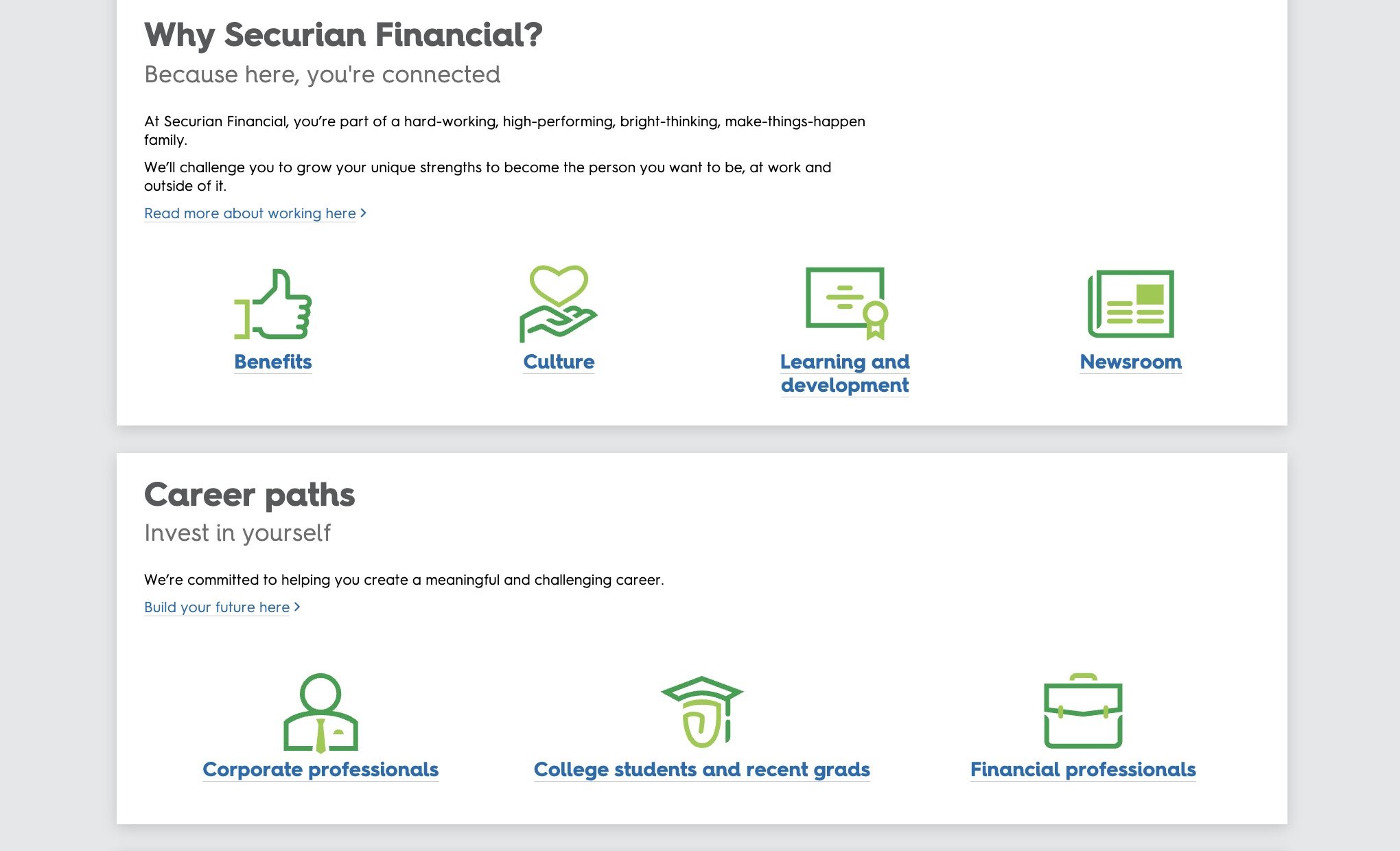
Prior to diving into design work, I spent time understanding the current system. Through a thorough heuristic evaluation and an information architecture audit, I documented the current website and its pitfalls, addressing similarities in challenges with the baseline user study findings.
02 — Anchor Links
Anchor links are by standard appropriate for longer pages.
Anchor links, while useful for long pages, added unnecessary complexity for a relatively simple careers site. Based on the baseline user study, users expressed preference for a straightforward experience without added navigation steps.
01 — Redundant Links
After mapping out the information architecture of the existing site, I identified several redundant links that led to the same article, such as "Working at Securian Financial" and "Investing in People” —these increase cognitive load and reduce user efficiency.
Users who participated in the baseline study via UserTesting.com also pointed out this redundancy, noting that it made finding specific information confusing.


What did we learn from this? Most of our competitors lacked a “Share Page to Social Media” feature—as this feature enabled users to share the Careers page to their social networks (Facebook, Instagram, etc). Instead, competitors included direct links to the company’s social page, enabling site visitors to follow. This initiated a conversation with the Marketing and Product teams on whether the use case for sharing the career page is necessary.
Moreover, our competitors did not use anchor link navigation, but rather organized common sections (Culture, Benefits, etc) into sub-pages. This reinforced our decision to reimagine the anchor link navigation of the site.
Competitive Analysis
I analyzed Securian’s careers page against competitors like MetLife and Northwestern Mutual. This comparison highlighted missed opportunities for simplified navigation and integration of social media, inspiring us to rethink the structure. These insights inspired us to brainstorm innovative approaches to redesign the navigation process.

How might we improve information architecture?
The Process — Defining a New Solution
Eliminating outdated or unnecessary content pages
Removing all redundant links
How might we streamline navigation across subpages?

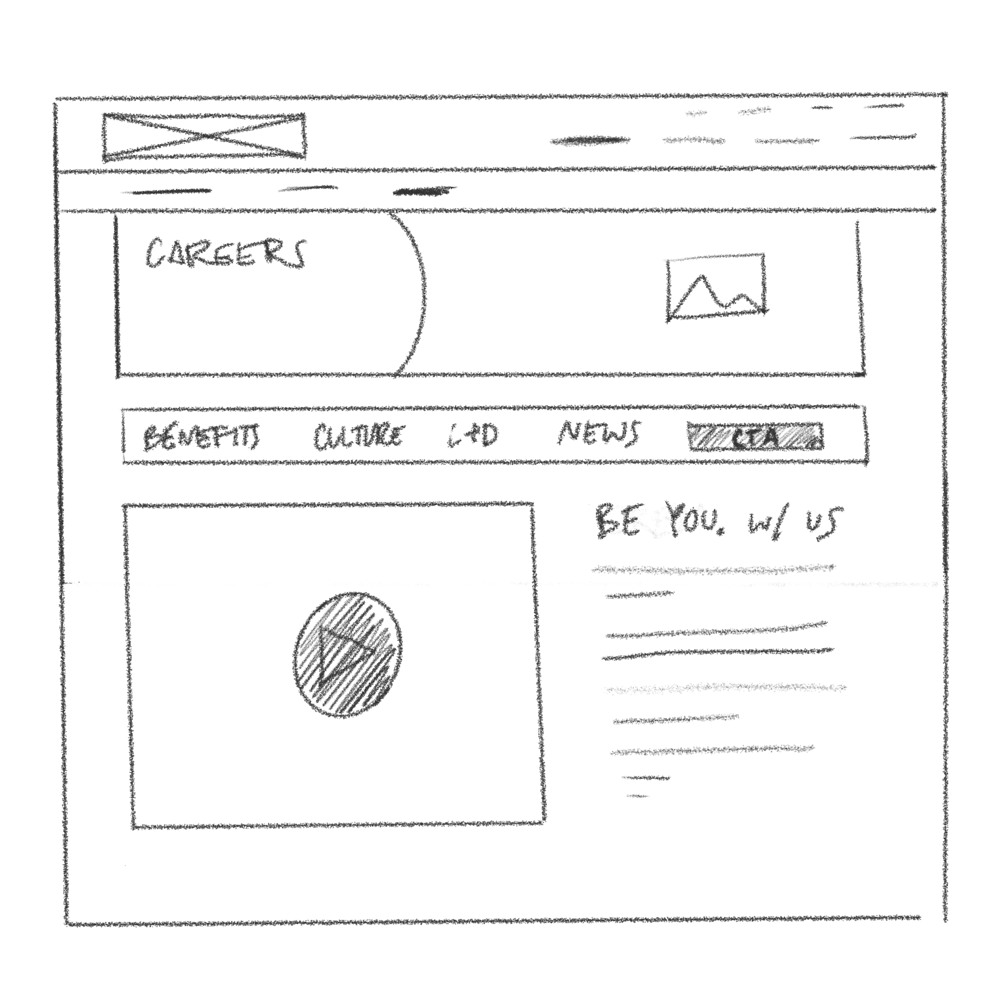
A static navigation bar allows users to easily explore Benefits, Culture, Learning and Development, News, and job openings.
Designing the placement of the promotional video
The stakeholders wanted the video to be a prominent feature on the homepage, complemented by sections of text that further elaborate on the company’s mission.
We considered the question: How can we balance adding the promotional video as a point of focus while respecting the existing critical career content?

-
Pros: The promotional video is large and center of focus. There is a dedicated section for explaining the company’s mission further.
Cons: Takes up too much space
Ideation — Low-Fidelity

-
Pros: More text to support the video and explain the company’s mission, allows video to stand out while not taking up too much space
Cons: Columns potentially causing a competition for attention

A Breadcrumb Trail: Introducing the Secondary Nav bar
To prevent users from backtracking, I designed a static secondary navigation bar. This allowed easy exploration of core sections—Benefits, Culture, Learning & Development, News, and Job Openings—without disrupting the user’s journey. A persistent Call-to-Action (CTA) button for job openings ensured users could access career opportunities at any point.
What’s the business value?
The strategic placement of a promotional video on the homepage creates an immediate, engaging introduction for users. It humanizes the brand and showcases the company culture, which helps in drawing in potential applicants.
This provides a concise yet impactful way to communicate the company values and work environment, making it easier for candidates to connect emotionally with the company, ultimately enhancing brand appeal and increasing qualified applicant interest.
The secondary navigation bar improves site usability by providing quick access to essential subpages. By simplifying access to key information, the design minimizes user friction and enhances the user journey.
This accessibility ensures that prospective applicants can easily find relevant information, reducing the likelihood of high bounce rates and increasing the chances of successful candidate engagement, contributing to higher application conversion rates.
Cross-Disciplinary Iteration & Idea Exploration
Collaborating with Developers
Our next step was to transform our low-fidelity wireframes into a high-fidelity prototype. By working with the Design Systems team, I was able to learn about Securian branding: the typography, color palette, buttons, etc. I collaborated with front-end developers on the Design Systems team to discuss the technical feasibility of the redesign and particularly the Secondary Navigation Bar. We ideated and made mockups in an iterative design process.

Visual Considerations
I used the Digital Asset Management (DAM) and discovered that there were multiple duplicate hero images across the site. To reduce redundancy and user confusion, I collaborated with the Marketing team to select new imagery that embodied Securian’s values of family and company culture.
Design Validation
After finalizing the high fidelity prototype, we conducted another user study with the repeated pre-study questions, tasks, and post-study questions as the benchmark user study at the beginning of the project via UserTesting.com, with 5 participants.
Below are the results.

Results — User Study
100% task completion rate
100% approval rate
from 5 out of 5 user participants on UserTesting.com

Outcomes
The final design was presented to 8+ stakeholders at Securian Financial, gaining unanimous approval. The redesign resonated with the company’s mission, creating a positive, inclusive, and accessible experience that attracted new talent. The site was officially published in Fall 2022, shortly after my internship ended.