TEMPLE HCI LAB
Predictive Anchoring Figure Redesign
MY ROLE | Graphic Designer
TOOLS | Figma
Understanding the Challenge
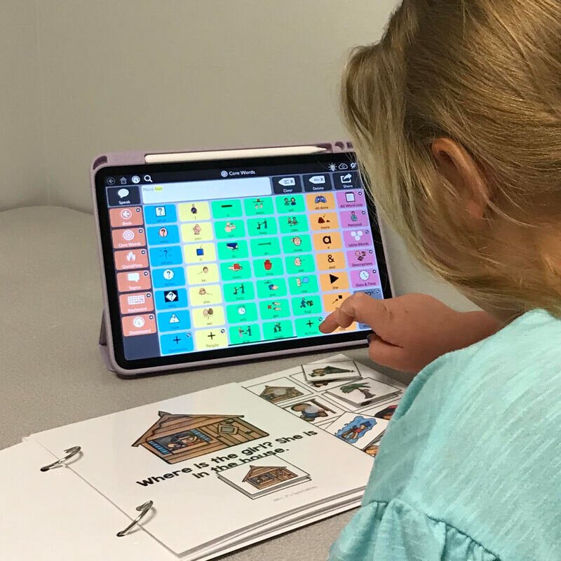
One of the PhD students in our lab, Cindy Zastudil, led and published a human-computer interaction project introducing a novel interaction technique for grid displays for augmentative and alternative communication (AAC)* The paper was accepted into the first round of ASSETS 2024.
In the required a revision phase, a reviewer shared the feedback: “The wireframe presented is simple. This is quite similar to many of the aforementioned papers in its essence. It is not clear how this specific design might help.” My role as a Design Assistant was redesign a more effective depiction of the novel interaction technique.
Original figure, prior to redesign (click to expand)
Understanding the Feedback
01 — Oversimplicity
02 — Lack of Novelty
Before starting the redesign process, I took time to thoroughly interpret the feedback and identify the pitfalls that the stakeholder (ASSETS reviewer) was communicating.
The wireframe is very simple and does not illustrate the long-press interaction, which may have led the reviewer to miss its significance and the value it adds.
Consequently, without a clear understanding of this interaction, the reviewer might not have recognized its utility or significance. They mentioned that it's "unclear" how this specific design would provide any benefit.
How might we…

More accurately depict the novel interaction?
Depict an action-based interaction two-dimensionally?
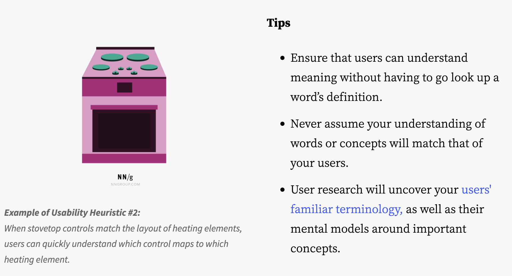
Use existing and recognizable design standards to depict this? Before beginning the redesign, I considered Nielsen’s Usability Heuristics, particularly Match Between the System and the Real World and Consistency & Standards. How could I depict a long-press interaction in a way that made sense to most users?
Match Between the System & The Real World, Consistency & Standards

From research, I learned that there is no single standard for depicting long-press interactions. The following designs were found across Google Search. These provided great inspiration and presented a challenge for me to reflect and combine ideas for my proposed design.

Design Iteration #1
I attempted to address the sub-page navigation by depicting that items can be nested within folders. To depict the long-press interaction to open folders, I used a gradient/bold circle.
Stakeholder Feedback: The arrow is confusing. Change the location of the example item to towards the bottom (near folders) to create an aligned overlay.


Design Iteration #2
I fixed the alignment challenge. Now, the navigation items within the folder overlay are aligned with the items in the original interface (non-overlay). Additionally, I opted for clearer one-tap and long-press icons. I also cleaned up the outline, ensuring consistency in the stroke weight. I temporarily removed the A,B,C… labels prior to receiving feedback on the recent updates.

Design Iteration #3
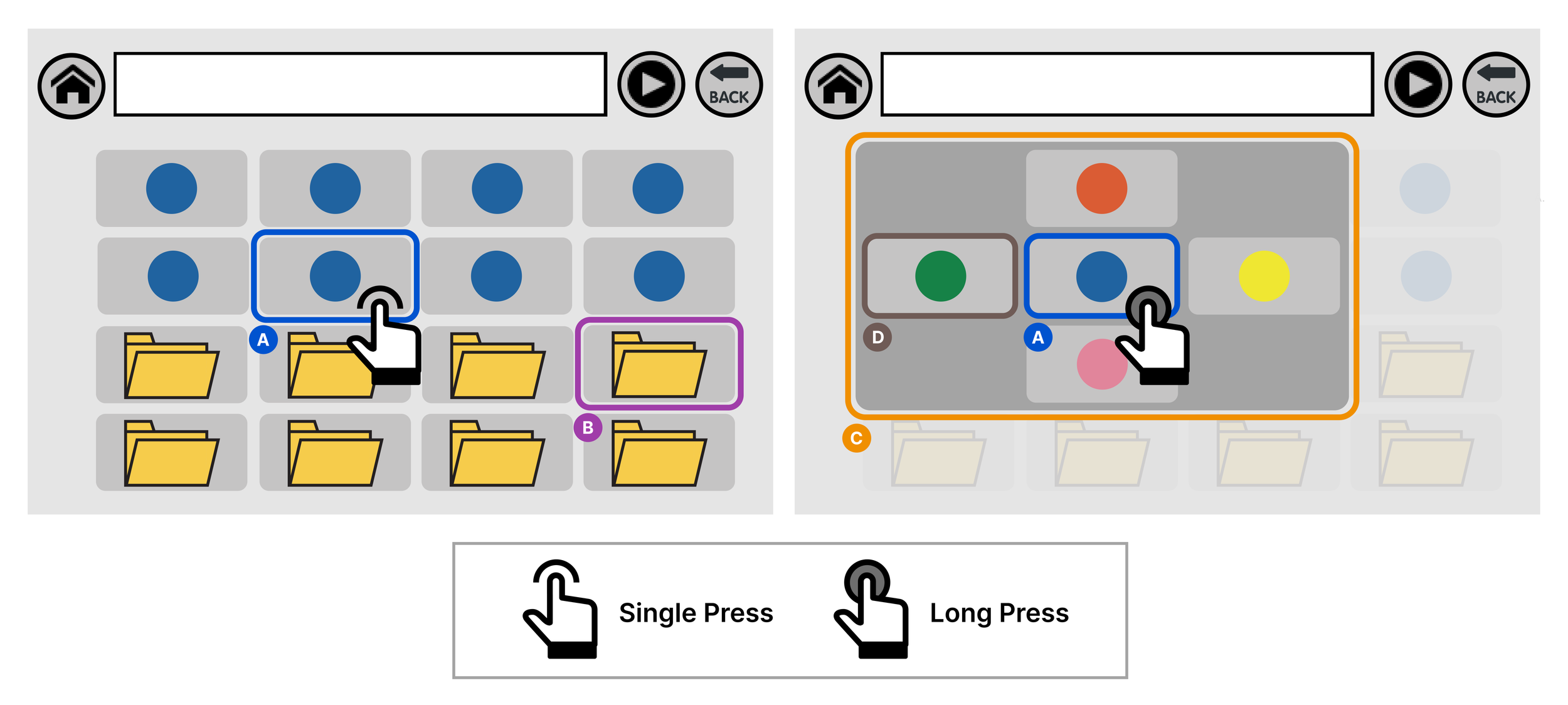
The design was well received by stakeholders, but required a few changes. To clarify and better distinguish between the single press and long press, I added a key, or legend beneath the interfaces. Furthermore, I added in the A,B,C labels to the design. I made color adjustments to increase overall contrast. Based on stakeholder feedback, I changed the icons to all circles as opposed to varying shapes (square, star, triangle), as the differing shapes might mistakenly communicate highly distinct navigational items, when that is not the main focus on the design.
Final Design in Camera-Ready Paper
Here is the final result of the revised figure, which was accepted. Read the full paper here on ACM Digital Library. A big thank you to Cindy Zastudil and her team for trusting me on this opportunity to redesign this representation.
Final figure, after redesign (click to expand)